Credit: Pexels.com
Logo design is constantly evolving. It seems that every time we turn around, there’s a new innovation in design.
But every new thing we learn is built on the backs of what has come before.
The logos that we know the best have some things in common. They’re memorable, effective, suited to the brands they represent, and unique, not to mention ubiquitous. But apart from those vital qualities, there are more specific lessons we can learn from famous logos that have stood the test of time.
Let’s take a look at five well-known logos and analyze what designers can learn from them.
Humanizing Your Logo Makes It Approachable — LG
LG’s logo has been around for a while, but it still stands as a great example of a corporate logo that is both elegantly simple and multi-layered. Nominally a lettermark logo, it is composed of the letters L and G in Helvetica Black type. However, the way the letters are designed, it creates an image that might be missed at first glance — a smiling face.
It’s incredibly simple, so simple that you might wonder why LG didn’t just go with a straightforward lettermark.
But there’s meaning behind the use of the stylized smile. Human faces, or features that are identifiable as human even when observed on objects or animals, are perceived as appealing and approachable. An observer is more likely to be drawn to a logo with a smile than a simple wordmark.
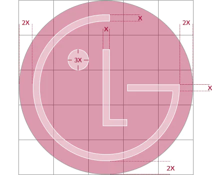
Image: LG.com
Other aspects of the LG logo are more symbolic — such as the circle in which the simple logo is enclosed representing the world and technology — but the simple smiling face is the most noticeable aspect. And it plays a big part in crafting LG’s logo in a way that makes the company approachable and relatable, and sends the message that dealing with this company should result in happiness.
The lesson we learn? Humanizing the design makes logos more appealing — even if is done simply and may be missed on the first glance.
Use Logos To Evoke Emotion — Tostitos
Tostitos’ logo is striking — chunky, unusual font, bright colors, heavy lines. Just looking at it makes you feel cheerful, as though you’re about to get together with friends or go to a party. It’s the perfect example of how logos can be used to evoke emotion.
Credit: BestLifeOnline
You may not think about the importance of emotion when it comes to designing logos, but as a matter of fact emotion plays a big part in logo design — at least, when it’s done right. Tostitos’ logo has managed to distill “party!” into an emotion — bright colors, festive atmosphere, and the fact that the T’s and the I are actually two figures sharing chips and salsa, which, by most reckonings, is the definition of a good party.
The lesson that Tostitos’ logo gives us is that emotion certainly has a place in logo design, and can be used effectively.
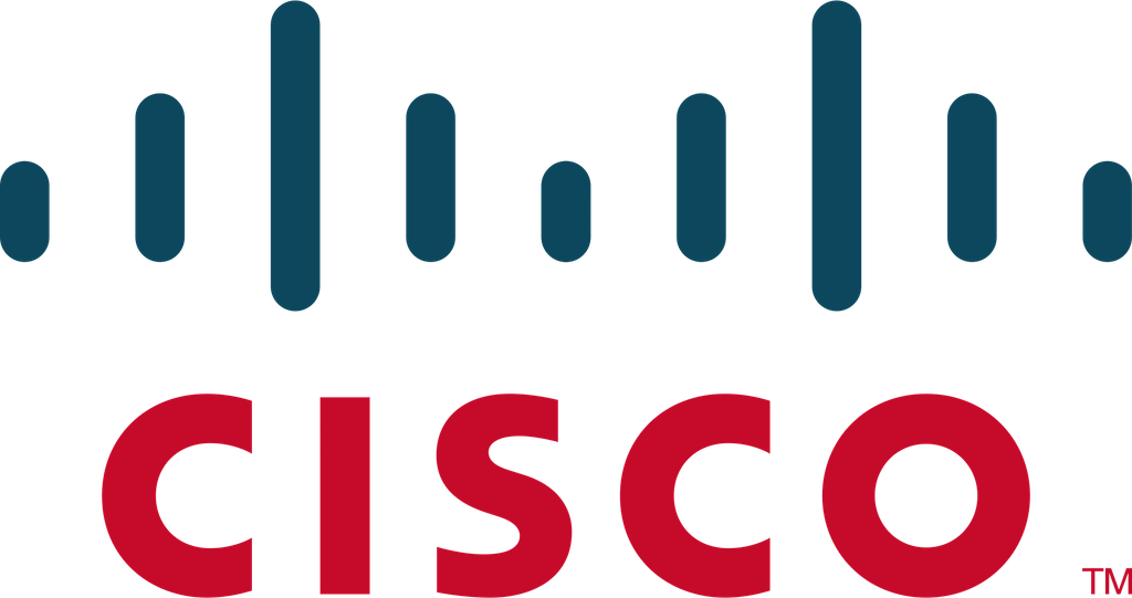
Personalizing A Logo To A Company’s History Helps To Tell The Story — Cisco
Cisco Systems was originally founded back in 1984, and eventually made its name in selling routers that supported multiple network protocols. Still a big business today, all it takes is a look at Cisco’s logo to know that the company hasn’t forgotten its origins.
Cisco was founded in the Bay Area of California, and headquartered in San Francisco — hence the name. But apart from that, the logo design is in itself a sly nod to the Golden Gate Bridge. The blue stripes of different lengths represent an electromagnet, but also are staged to look like the famous landmark.
This may not be noticed by everyone, but for those who are local to the area or those who know the history of the company, it’s a nice touch. Little details can go a long way to creating a connection with the audience, especially when those details are used to help the brand tell its story.
Credit: BestLifeOnline
History is important to a brand’s personality — so is telling the story — and personalizing the logo design with a detail like this becomes an integral part of that history. It boosts connectivity with the audience, and gives them another point of empathy and emotion with the brand. Everyone likes to see a company that is proud of where it came from, and acknowledging their origins is an appealingly humble move for a big business.
The lesson we learn from Cisco’s logo design is that logos can be used to tell the story of the company.
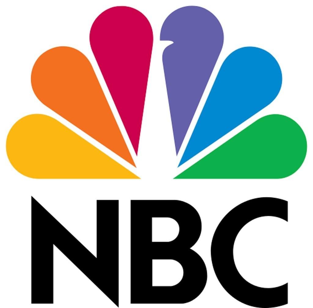
Use White Space Effectively — NBC
NBC, or the Peacock network, originally designed the logo around the concept of being “proud as a peacock.” The logo has gone through multiple variations over the years, but one important design element has been consistent, and that’s what we draw our lesson from today: effective use of white space.
Credit: BestLifeOnline
The peacock logo is simply and efficiently designed with a restrained amount of individual elements, putting across the shape of the peacock without adding too many details. The white space in between the colored feathers is what delineates the peacock body and beak. Especially considering how many colors are involved, it’s an amazing example of how to create a logo that is dynamic without being overwhelming.
A small side note is that, though conventional wisdom dictates that companies shouldn’t use too many colors in their logos, some rules are made to be broken. Or at the very least bent.
Logos Should Match Brand Personality — Google
The personality of a brand is more than just what meets the eye, but that doesn’t mean that what meets the eye isn’t important. As your logo is the “face” of your brand, it’s vital that it sends the right message about what your brand personality is.
Google is a great example of this. Google wants to present a brand personality of being a positive-vibed, relaxed, fun, innovative company. Rather than using a kooky font or whacky graphic style, they opted for a wordmark or logotype logo. The simple, stripped down logotype is perfect for a tech-based company, but still expresses the fun, relaxed, positive vibe of the brand personality through its use of bright colors.
Even the way that Google adapts and changes its logo for different occasions — or just for fun — reinforces the personality that it wants to promote.
Google’s logo design teaches us that a brand’s logo should match and reinforce the brand personality. Harmonious branding is vital for effective marketing and company growth.
Leave us
a Comment!